PROJECT OVERVIEW
The goal for this project was to help our team create a smooth experience when delivering information from the back office application to the new mobile app. My job was to identify the main interaction points on both ends to help our UI designer come up with the right mock ups to review and test with our users.
CORE FEATURES OF APP
HOW THIS APP WOULD CREATE PRODUCTIVITY
This technology solution would directly supports the “Documentation” phase of the commercial construction process.
DIFFERENT TOUCH-POINTS; SAME SOLUTION
CUSTOMER JOURNEY / USER TASKS
USER NEEDS ANALYSIS
The needs of the end-user centered around 3 things:
• offline documentation
• map viewer to locate installations
• ability to tag or label photos
CONTENT AUDIT (back-office)
This was a critical exercise that helped us understand the type of information being gathered from our users using the back-office application. There was a great amount of details needed to be inputed into the project; however, it was not initially clear in what order the information should be entered. We worked with our internal account managers to understand the typical workflow when setting u a project before it gets sent to the job site for documentation.
Wireframe Mockup
This initial mockup was created to show how the content of a user’s project could be managed. It would consist of a left panel with the projects or “assignments” (also a term in the industry) with a modal next to it that would contain the main contents of the project.
INCORPORATING SERVICE DESIGN
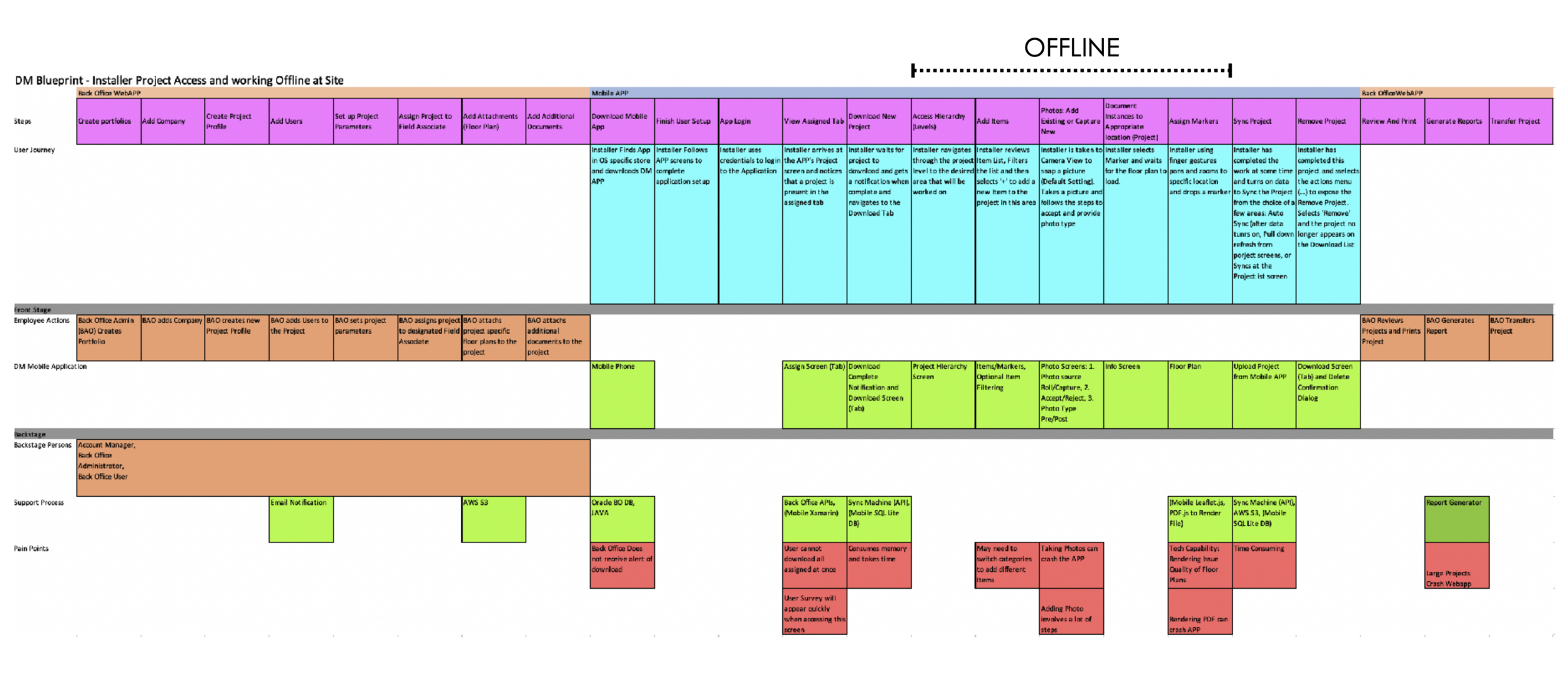
I helped facilitate a service blueprinting workshop to get a better understanding of where the gaps are in the product and the constraints that exist across our team. The purpose of this workshop was the following:
• Includes seen and unseen areas
• Shows overall view with mapped dependencies.
• Helps Discover weaknesses in the experience and system.
• Identify opportunities for optimization
• Shows cross dependencies in the system and departments


